Why does this happen?
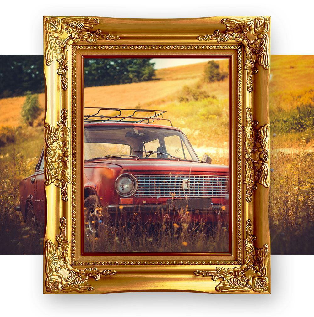
Let’s imagine that the picture frame in the image above is in fact digital and holds images on your website. OK, hold that thought, and we'll dive right in.
We build our sites to be robustly responsive. This means that regardless of the device a user views it on and whatever images have been included, the layout will update to ensure an elegant, rhythmic and frictionless user experience. One way we achieve this is ensuring images always fit neatly, and without distorting, inside their ‘digital picture frame’. A landscape image can then be used within a portrait frame whilst a portrait image could be used within a landscape frame.
We use CSS code to ensure that, regardless of the image used, there are no unsightly gaps within the frame and that the largest possible area of the image is visible, this however means that some of the image edges will be cut-off (cropped). Depending on the combination of 'picture frame' aspect ratio to image aspect ratio, the area that is cropped will differ. The dimensions of these 'virtual picture frames' are determined in different ways depending on the design of the layout. There can also be multiple different 'digital picture frames' within the same page layout.
The image is sometimes cropped differently on mobile devices compared to desktop
This is expected behaviour!
'Digital picture frames' on mobile sized devices often, but not always, have a different aspect ratio to the desktop page layout. This ensures that the screen real estate is always utilised to its full potential whilst the codebase remains device agnostic.
So how do I choose a good image to use?
An image that has the same aspect ratio and orientation as its frame will be a perfect fit. Although remember that this aspect ratio may differ between devices. A good idea is to choose an image that is the same (or approximately the same) aspect ratio as the desktop layout ‘picture frame’, but also works well on the mobile layout - or vice versa.
Key Considerations
- Images should not include any text
- This will ensure that the text is never cut-off
- Any text accompanying the image should be added as neighbouring content
- This will ensure it remains responsive
- Whilst also being visible to web crawlers – all about those SEO gains
- The focal point should be within the area of the image that remains visible across all devices. This is usually around the centre
- Try to avoid images where the focal point is near an edge - as it is likely be cropped on some devices
- The natural dimensions of the image are no smaller than the dimensions of the virtual picture frame on a large desktop screen
- This will ensure that the image does not pixelate
- The natural dimensions should also not be any larger than its frame
- Whilst a large image won’t break the layout, it will adversely affect the webpages speed, UX and SEO performance
Some good examples of 'crop friendly' Images
All of these images will still look good - and tell a story, even if a large proportion of either the horizontal or vertical edges are cropped.
The image focal point doesn't necessarily have to be at the centre of it. The central area should however portray the key message of the entire, un-cropped, image.
Some not so great image choices
 These may look good in isolation, but if the edges were to be cropped, the focal point of the image is lost and with it - the essence and story the image tells. Pardon the pun - but some users may not get to see the bigger picture.
Images such as these with 'edge cropping sensitive focal points' are best reserved for inclusion in your content pages - more on this further down.
My CMS has some cropping options, is this the same thing?
Many Content Management Systems (CMS’s) can be configured to facilitate cropping within the User Interface of the CMS. When applied this will fetch the image from the server ‘pre-cropped’ – the crop being applied to the image asset itself and not its ‘virtual picture frame’. This is useful in certain situations such as for ensuring the image is not served larger than necessary. This pre-cropping allows for an additional level of optimisation and control if used correctly - it can however cause more issues than it solves if not used properly.
Can the page template be setup so that no images are cropped?
Any images that are used structurally (e.g. background images, banners, thumbnails, tile images etc) usually have to fit in with the underlying layout and structure of the page. These ‘virtual picture frames’ may not always match the images natural aspect ratio or shape. This is why we ensure, on the fly, that the image fits. If this technique was not used, the flexibility of being able to include a range of images with different aspect ratios would be limited.

Content images are usually not limited to the confines of a ‘virtual picture frame’. These instead sit within the page flow as if they were photographs stuck intermittent of scribbles within a scrapbook.
Takeaways
-
The on the fly image cropping commonly seen across the web is used to ensure the robusticity of webpage layouts across multiple device sizes.
-
Images should be carefully selected to fit both the mobile and desktop layouts of the websites design. This will ensure a device agnostic, elegant user experience.
-
If a less than ideal image asset for its ‘virtual picture frame’ is used, it can seem like there is an issue with the website layout - whilst some users may not be privy to 'the bigger picture'.
-
With a little consideration along with some trial and error, you can choose great images that will work well on your website across a huge range of devices.
Posted by
Michael Wood
Senior Producer
Molly Sheridan
Digital Producer