Solution
With high traffic levels meeting high bounce rates, both a technical SEO and Usability audit of the previous site was essential - carrying our learnings through to the IA, user journey mapping and design sprints.
Audits are a great way of identifying problem areas with a website that are blocking conversions. For Herschel, they combined Google Analytics insights with usability heatmaps and anecdotal evidence, through interviewing Herschel staff and a select group of real customers.
Before interacting with the brand, the aim was to encourage more customers to immediately think 'infra-red' when heating their business or home, and with Herschel re-positioned as synonymous with infra-red heating.
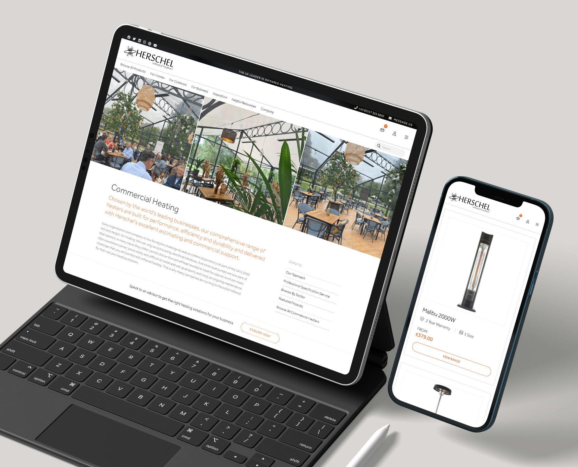
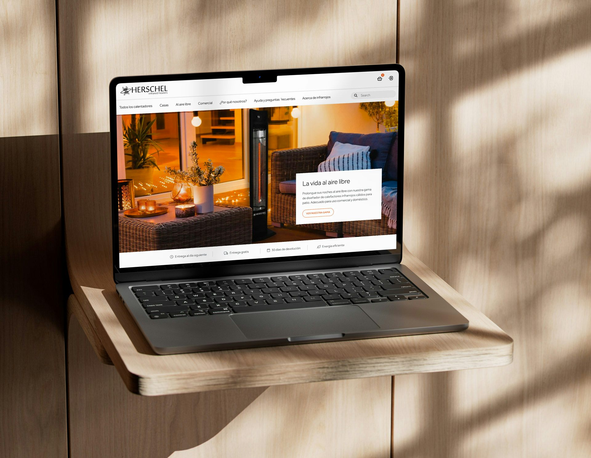
Our branding experts stripped back the on-site logo to its core typemarque; providing a more confident positioning and lifting the overall presentation, whilst establishing a more coherent and elegant digital visual identity aligned to Herschel’s sleek & minimalist product range.
This brand repositioning also needs to address suspicion around infra-red by making more of successful client installations and case studies. Immediate reassurance is created through a more premium, progressive presentation with full-width, immersive shots of client installations, combined with testimonials, reviews and a live chat feature.
We introduced a rationalised and simpler navigation structure, for more effective signposting and segmenting across target user-groups: residential, commercial, architects, designers.
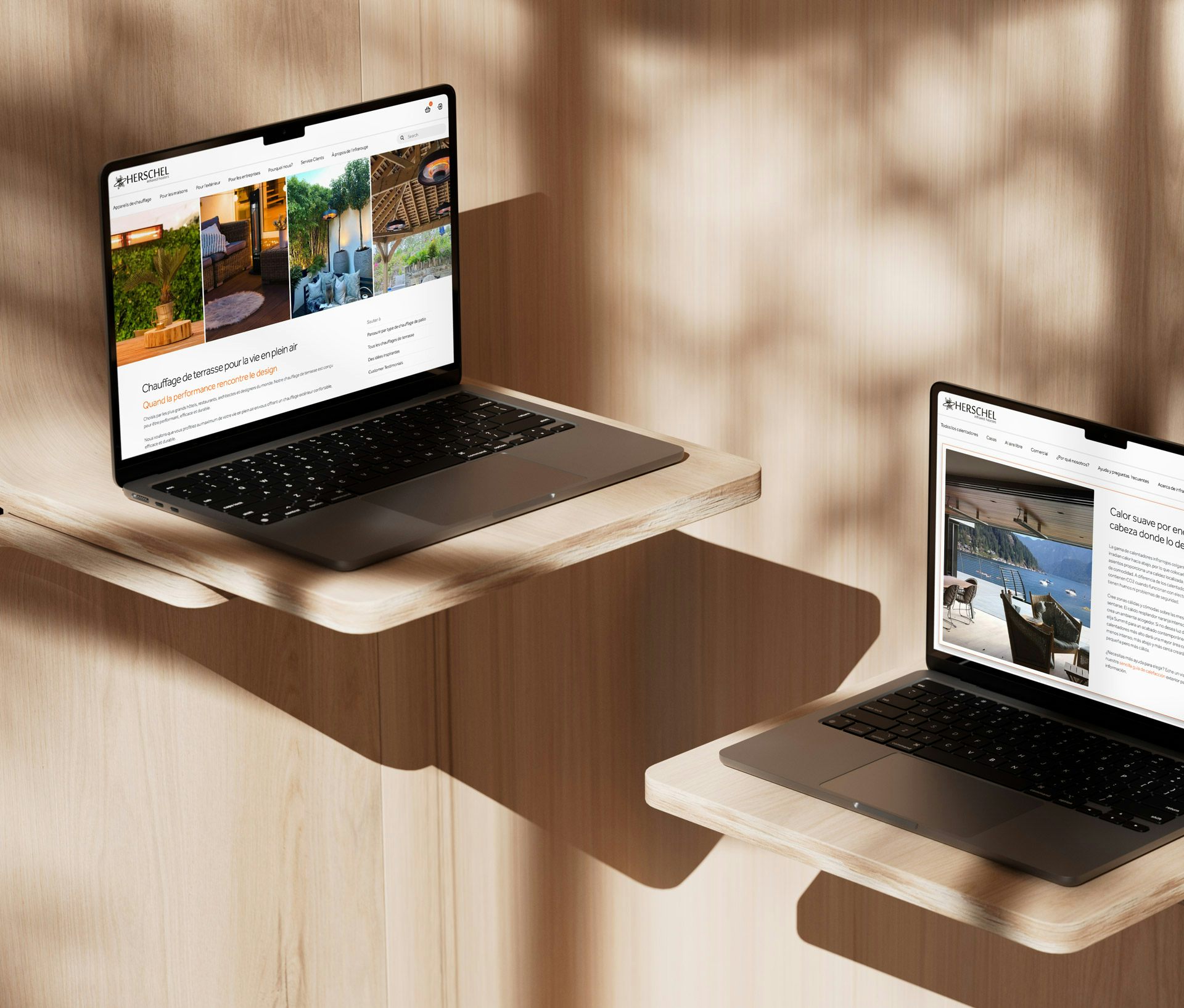
The domestic market typically follows the commercial market's lead which is why both are combined through the one site and with the visual case studies incorporating links to the products featured, providing clear journey continuation for the end-user.
Dovetailing with this new structure are communication themes, which distill key messages around Sustainability, Efficiency, Design, Affordability so that these can be better peppered throughout the UX rather than housed in text-heavy standalone sub pages.
To optimise conversions and reduce the bounce-rate, we established a slicker, more immediate product listing format, with a simplified product calculator & streamlined checkout flow. The Cart toggle is now sticky so that it's available and clickable at all times.
Design direction and a style guide was a key part of our client team hand-over ensuring a coherent and consistent suite of country-specific front ends.
"We are very pleased with the look and feel of the new theme that Radiator come up with, it has really helped re-position and lift our website in-line with our highly regarded brand. We are so pleased with it that have rolled this out across our overseas websites. Radiator stuck to the brief and delivered within relatively short timescales. Thanks to the design work Radiator did on the website we have decided to adopt similar design themes for our other marketing collateral."
Paul Morley , Director, Herschel Infrared